
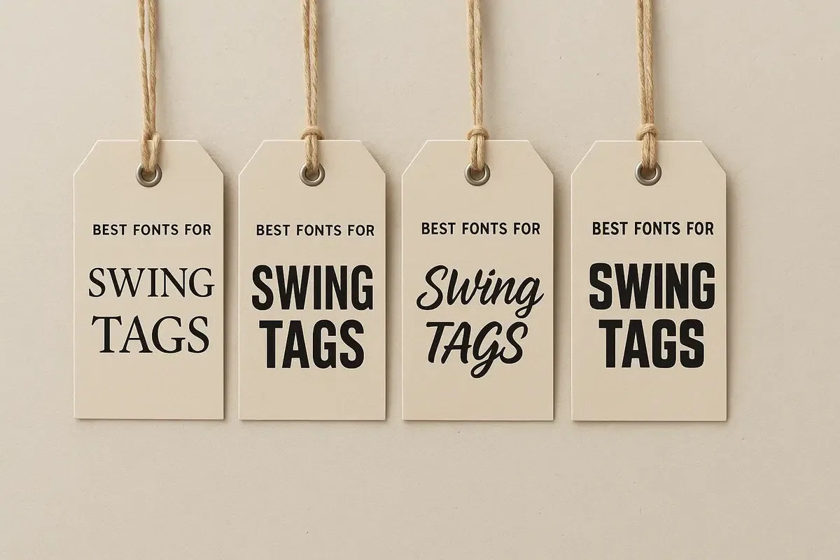
Design for the tag in the hand
A swing tag is usually read at close range, but often quickly. Prioritise the product name, size, price or action the reader needs first. Secondary detail can be smaller only when there is enough contrast, space and line length to keep it comfortable to read.
Decorative display type can add character, but it should not compete with practical information such as care instructions, product codes or prices.
Build a clear hierarchy
Use differences in size, weight, spacing and placement to show what matters most. Avoid relying on all capitals, very thin strokes or low contrast for essential copy, particularly on textured, dark or uncoated stocks.
Leave enough room around small type and do not place it too close to a fold, hole or cut edge.
Protect the final type treatment
Before sending files, confirm that the final artwork will not substitute an unavailable font or change the spacing. Follow the agreed handover method for fonts and keep a review PDF as a visual reference.
Practical checklist
- Check all essential copy at the final printed size.
- Use a clear hierarchy for product, price and supporting information.
- Avoid placing small text beside a hole, fold or trim edge.
- Confirm the final file preserves the intended fonts and spacing.