
Protective Lamination
Compare surface appearance, handling and writability before adding a film to one or both printed sides.
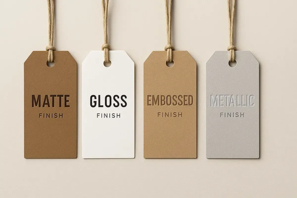
Finishes and attachments should solve a defined visual or handling requirement. Compare laminations, foil, Spot UV, embossing, debossing, die-cutting and perforation alongside the base card, artwork and intended use.
A finish changes more than appearance: it can affect recyclability, writability, fold behaviour, scuff resistance, production time and artwork setup. Confirm compatibility before treating an effect as part of the final design.
Compare surface appearance, handling and writability before adding a film to one or both printed sides.
Use contrast selectively. Foil, raised or recessed detail and gloss accents work best when the highlighted area is deliberate.
Cutting and tear lines affect structure, safe areas and information placement, so they must be planned before final artwork.
Match hole, reinforcement and attachment choices to the product, tag weight, presentation and method of removal.
Use lamination when surface behaviour is the central requirement; foil or Spot UV when a controlled area needs contrast; embossing or debossing when relief is important; die-cutting when silhouette supports recognition; and perforation when part of the tag must detach. Combining effects can introduce registration, fold and material constraints, so prioritise the feature that matters most.
Special finishes normally need clearly identified production artwork rather than a visual mock-up alone. Check the artwork guide and the specific finish guide for file preparation, safe-area and coverage considerations.
You can add lamination, foil, and strings directly in our quote configurator.
Configure Tags