
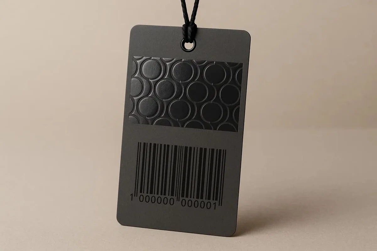
Use contrast deliberately
Logos, patterns and broad graphic shapes usually show the effect more reliably than fine text. The gloss is most visible as the tag moves under light, so the underlying print and surface finish remain important.
Artwork setup
- Supply the varnish area as a separate vector spot layer.
- Use solid shapes rather than tints or gradients unless specifically agreed.
- Allow for practical registration tolerance around printed elements.
- Keep critical varnish detail away from trim, folds and drilled holes.
- Confirm minimum line and gap sizes for the production method.
Proofing limitations
An on-screen proof can confirm position but cannot reproduce gloss level or tactile contrast. Spot UV can also affect writing, adhesive labels and barcode reflections, so test functional areas separately.