
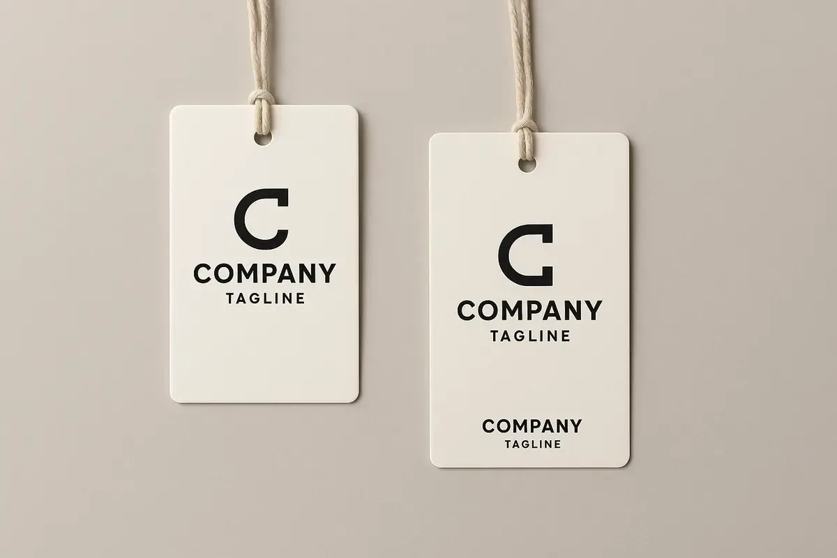
Logo Placement

Logo placement on swing tags

Place a logo where it can be recognised quickly without competing with the product information the tag needs to carry. The right position depends on the tag’s orientation, attachment point, viewing distance and whether the logo shares a side with a price, size or barcode.

Decide what the reader needs first

For a brand-led presentation, the logo may lead the front of the tag. For a price tag or care tag, the product identifier may need to lead instead. There is no single correct position; the hierarchy should match the tag’s job.

Keep the logo clear of the drilled hole, string and fold. A logo that is visually centred on a flat layout can feel off-centre once the tag is attached to a product.

Use contrast and clear space

A logo needs enough contrast against the chosen card and finish to stay recognisable. Give it breathing room rather than surrounding it with decorative elements, dense copy or a barcode.

If the artwork uses a coloured or textured stock, check whether the logo needs a different version or a printed panel to remain clear.

Check both sides and the product view

Mock the tag up in its likely hanging position before approval. This reveals whether the logo faces the customer, whether the string interrupts it and whether the back carries more practical information.

Practical checklist

  • Decide whether brand or product information leads the tag.
  • Keep clear space around the logo.
  • Check contrast on the selected stock and finish.
  • Review the tag hanging on, not just beside, the product.

Continue planning your tag

Decision context

Place the logo within an information hierarchy

A logo needs sufficient clear space and contrast, but it does not need to occupy every available area. Establish the viewing sequence between brand, product name, price, care, code and call to action. The tag should remain identifiable while practical information stays easy to find.

Work with the actual shape and attachment point. A centred logo may appear unbalanced after a hole, string or eyelet is added, and a wide mark can lose impact on a narrow portrait tag. Test front and reverse as one object rather than treating them as unrelated pages.

Use an appropriate vector master and preserve the logo’s proportions. Avoid rebuilding a mark from a low-resolution web image. On dark, kraft, coloured or textured stocks, confirm whether ordinary process print has enough contrast or whether an opaque ink, foil or different placement is needed.

Review the final-size mock-up on the product and in its retail or packaging context. Keep the mark away from trim, folds and production paths, then record the approved colour treatment. Consistent placement rules make later size and product variants easier to control.